How to Build a Responsive Live Chat
admin
- December 1, 2016
As communication habits change, the desire to receive individual and fast online support grows steadily. Live chat has long been established as a tool and is particularly useful when a customer needs help buying something online. One of the challenges lies in creating a live chat that looks and functions the same across devices, including smartphones.
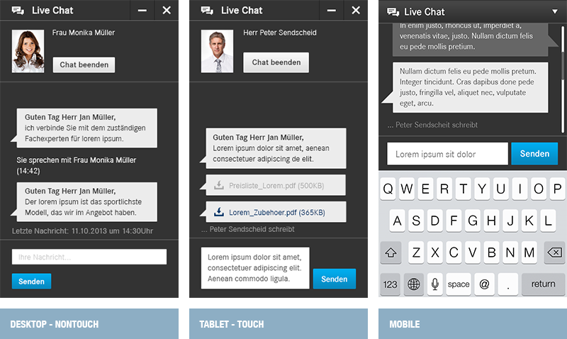
mediaman recently built a responsive live chat for a German company, with a branded look and feel and typical chat functionalities. Adapting the interface and interactions to the different devices used up about half of the development process. Starting at a screen width of 768 pixels, desktop devices display a non-touch version, while tablets display a touch-based version in a fixed layer. On smartphone screens up to 768 pixels wide, users see a fullscreen, flexible touch-based version.
Flexible helpers are always there
As soon as a visitor needs support, the live chat can be opened from any page. For desktops and tablets we implemented a sticky side tab. In high screen resolutions, it gets displayed in a maximum version with a label, on smaller screens it shrinks so it doesn’t cover up important content underneath. The chat layer itself has a specific size, but it can be moved around or re-sized so that other pages can be accessed while the chat conversation continues. Even if the chat layer gets minimized, users are alerted to new messages by a visual hint within the chat header.
Smartphone users access the chat through a pop-over bar, which lives at the bottom of the screen. By swiping up and down the chat can be opened or hidden. The open chat window always takes up the whole screen, so that messages can be read while the keyboard is displayed.

Each conversation needs a sound foundation
The chat module has the same structure on all screen resolutions. Unlike the smartphone version, though, the higher screen resolutions with a fixed layer height required a separate button bar. This allows users to see all options. The lower section, consisting of the entry field and the submit button, grows when a message takes up multiple rows. A maximum of three lines of text is shown, after that, the entry field becomes scrollable, which requires the mid section containing the chat history to be flexible in height, as well. For mobile usage, we had to consider not only a growing entry field, but also allow for the keyboard to be displayed. Dor a better user experience, the keyboard pushes up the chat history, moving the header bar out of sight.
Keyboard or big thumb
The size of all interaction elements was determined with optimal touch screen usability in mind. Larger buttons (or touch sensitive areas) guarantee that users can hit the desired option without a problem. In addition to growing buttons, dropdowns, and entry fields, as well as adaptive spacing, the font size is responsive, as well. It grants the best possible readabilty on small devices. Simple structure, functionality, and flat design are things that users know from other chat applications such as Skype or Facebook Messenger. That makes it easy to use, both with a keyboard or thumbs.
Chat as a playing field
Customers only use a live chat if the interaction is pleasant. Without a flexible solution, the module cannot reach its potential, or multiple versions for different devices need to be built. Since mobile usage is steadily increasing, a device-sensitive implementation is the best solution to get users to seek support without having to first initiate a call. Once a user is engaged in a chat, the barriers for different kinds of interactions are lowered. For example, if more support is needed, the chat could be turned into a voice call or even a video conversation. Responsive live chat serves the mobile generation’s modern communication needs.