Increasing User Registration on Your Financial Website (or any other, really)
admin
- December 2, 2016
Getting financial advisors to sign up for something on your website is, for some, the Holy Grail. It’s not hard to understand why; financial companies such as fund managers and insurance providers want to send them relevant newsletters, sell them products and provide them with targeted information. This strategy applies to many companies across many other industries, but for the purpose of this article, we’ll stick with the financial sector.
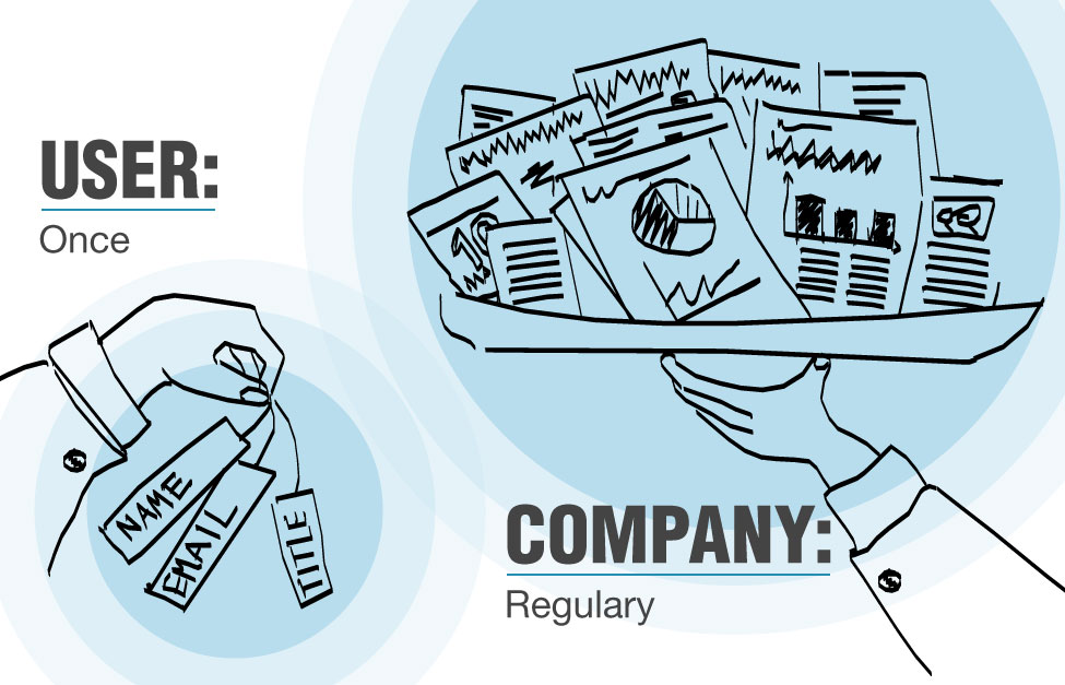
So, why push for registrations? For one thing, they’re measurable, and data is valuable. It allows companies to see which newsletter topics made users click through, which articles they read, right down to the specific person. This information goes beyond what web analytics can tell us. When a financial advisor downloads a document about a specific topic, a wholesaler can send a follow-up email or call him to offer to answer any questions he might have about it (subtly, of course – no spamming or being creepy).
Over the years, I’ve had a lot of discussions with clients, including wholesalers, about collecting data, using short forms, and using gated sections on their websites. Here’s some key advice on what works best:
1) Have something worth signing up for
Here’s a typical scenario: a client wants a gated section in order to collect data, which means making users sign up to access it. While that goal is understandable, it is my task to see things from a user’s perspective and ensure there is something there for them to sign up for. It’s not a good idea to disappoint them. Users are picky about who they give their data to. They understand the process is a trade: they give you something and they get something in return.

What you give them may be great content that they cannot get any other way. In the case of retail, it could be special deals — I like being offered free shipping. Make sure you have content that lives on the site and gets updated regularly. For example, if you require users to sign up for a newsletter, come up with a content strategy for what you will be sending them and stick to it so they become a dedicated audience and stay subscribed.
2) Tell them what they are signing up for
Once you have that content strategy, be sure to let users know what great things you have in store for them. Nobody signs up for a newsletter because they don’t get enough email. I would guess that around 80% of the newsletters in my inbox get deleted unread. The only reason for me to subscribe to yet another newsletter is that I really, really want what’s in it (like a link or code I can use for free shipping).
The same is true for gated sections: explain what is waiting for them and why that content is only made available to those who sign up for it. As I mentioned earlier, users understand the act of registering is a trade. But they’ll only do it if they have a clear understanding of what they will get in return.
3) Make it easy
A lot of research has been done about web form usability and increasing conversion rates. If you want to dig into this deeply, I recommend you visit Luke Wroblewski’s website or read his book on Web Form Design. Here are some key points:
- Cut the number of fields down to the bare minimum. Reducing a Contact Us form from eleven fields down to four could increase submissions by as much as 160% and conversions by as much as 120%. Ask yourself if it is more important to add subscribers to your newsletter, in which case an email entry form would be enough, or get more data, which could decrease subscriptions.
- Simplify the process. It’s a great idea to ask users to create accounts during the check-out process to get users to come back, collect their data, get permission to use it, and make it easy for them when they return. But if a customer is not ready to commit, they may abort their order at check-out, which is something you want to avoid. If you make account creation optional, offer additional perks for creating an account, and are considerate about where in the process you offer it as an option, more users will complete the order process.
- Be helpful. Make it easy for users to fill out forms. Try not to require a certain format (e.g., for phone numbers), and if you do, be specific about what that format is (e.g., tell them exactly what your password requirements are). Never ask for information you already have. If you have the ZIP code, don’t ask for the city and state. If you have the credit card number, you don’t have to ask if it’s a Visa or a MasterCard.
4) Be willing to test
If your product managers, marketing managers, or sales team are hesitant to follow your UX specialist’s recommendations because they don’t want to give up the opportunity to collect user data, change your forms for a trial period and monitor the results. Numbers can be more convincing than words. If those results are unimpressive, you can always change things back. That’s the great thing about the web. Nothing is permanent, so it allows you to be agile and responsive.
The primary goal of our financial clients is often initiating a dialogue with investors or advisors through their websites. Once that dialogue is flowing, and the target audience has grown to appreciate the support and information it receives, more data can be collected. Many long-lasting friendships have started by making small talk at a party.