Responsive Webdesign, Edge Reflow and Prototypes
admin
- December 1, 2016
Last week I was asked to write a post about Adobe Edge Reflow and I thought: That’s easy! I’ll just describe how I am using it and how I like it. That ended up being far from the truth. The more I thought about my post and the more research I did, I realized that Edge Reflow is not the topic at all. I wanted to write about more than my experience with the tool.
The topic is our adaption to responsive design. Websites no longer have a fixed pixel width and have to be optimized for all kinds of devices. We are not designing pages. We are creating fluid systems. So how do we have to change our workflows? Our tools, our roles, and our communication? How can we adapt our traditional workflow to these new circumstances?
“In order to effectively design for today and tomorrow’s Web, we must replace outdated design artifacts with real collaboration and communication.” — Brad Frost
Living wireframes and prototypes
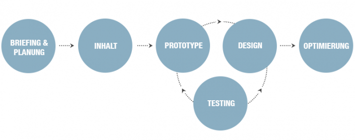
Responsive design calls for much earlier prototyping in order to test and optimize structure, functionality, semantics, and design. „Designing in the browser“ seems to be the solution. No more static layouts in Photoshop that will be put into code towards the end of the project. Everything that is created is immediately put into code, a living wireframe develops, which is continuously improved. In the end, the prototype is transformed into the final product.
“Designing in the browser” also means “content first” – and typography first! In an optimal workflow the layout can only begin after all the content has been collected. All copy and maybe even all images should be available. Only in this way can we create a design that matches the content. It is crucial that everyone involved – design, UX, developers, collaborate from the start.
Optimized workflows for responsive design

Traditional, less ideal workflow

Why do we design web pages in environments, in which they will never live?
People say Photoshop will go extinct. Fear not. Photoshop won’t go away. It’s still the tool to define the general layout of a page and develop style tiles. But creating responsive designs only in a pixel based, static tool can’t be the solution. In this case, Photoshop is inappropriate as a single tool. Here is why:
First of all, Photoshop is not a web design tool. It’s a visual design tool. It can only ever show one status, no transitions, no interactions. Photoshop can never show what the page will actually look like. So why would be design pages in an environment, in which they will never live? In order to show different states or media queries, a vast amount of layouts have to be created. And they will end up in the trash. If changes need to made, they have to be made in each single query or state. In a site with four or more breakpoints, that’s a huge effort. Work is duplicated, just to get thrown away. Typography, for example, gets designed in Photoshop, first, and then it gets coded in the next step. Wouldn’t it be easier to start with a living style guide in the browser? CSS and html changes are made much quicker and easier than adapting 20 Photoshop files.
When we create our design directly in the browser, we can’t think in individual pages anymore, either. Instead we build a modular system, which also helps us to keep our eyes on functionality. The client sees what he gets from the start. We don’t need to spend a huge amount of time explaining how something works, how the page will look in different browsers and on different devices.
The end of endless static layouts
Adobe Edge Reflow may be a new, important tool for all of this. It is a combination of Photoshop, Illustrator, Fireworks, and Dreamweaver. Designers can build a fluid prototype which can be displayed on different devices – without having to write any code. Edge Reflow offers a canvas on which we can layout intuitively and visually, with the help of text tools and containers. A great feature is the slider on the right hand side. It re-sizes the canvas, so that designers can simulate different browser sizes and devices. All elements on the canvas behave fluidly; they re-size or change their position. For a designer who has only ever worked on static Photoshop layouts, this is an unusual, delightful sight.
Apart from a few bugs, Edge Reflow is a great thing. After the initial familiarization, it’s a big time saver, because I don’t have to build multiple layouts for different media queries. It helps me immensely to be able to see how a layout behaves fluidly in its early stages. Early on, I become aware how certain elements will behave, which helps me to recognize and solve problems early. It gives me a completely new view of my layouts, I begin to see the big picture of a fluid, modular system, functionality and user experience become more significant. And the feeling after transforming a static layout into a fluid one within a few hours was amazing.
This requires basic knowledge in CSS and html that not every designer has. But it doesn’t have to remain that way. Learning is fun! Saying goodbye to things that are well known can be hurtful and uncomfortable: But I don’t want to keep myself from broadening my horizons.
One final thing: Edge Reflow is a tool for building prototypes, not websites. So just like Photoshop, developers won’t go extinct any time soon.