User experience for App’s – Scatter the cloud and see the essence
admin
- December 2, 2016
After designing countless desktop products, I got used to trying to put the patterns of PC design into all Apps. Spending a lot of time thinking and considering how to best enhance sensibility, how to sort out the functional logic, how to add interesting interactive elements and how to realize a fantastic marketing strategy. Because at the end of the day, you want to impress your clients. I suddenly asked myself, whether such a small mobile device can bear all those big expectations.
Brief but not too simple
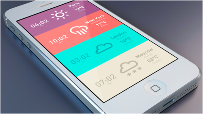
There is a saying that less is more – it’s true, especially in the mobile world. The limited screen size forces designers to make difficult decisions. When you can only pass one message to your users, which one should it be?
The infinite possibilities can cause inner conflicts. You will find it easier when you review all contents again, your ideas become clearer. Simplify the priority of user demands and focus on the core value. Every application has its own specific user group and advantages so that more aggregation, more accuracy will hit the bull’s eye of every user.
Logical but not over-complicated
Designers should always keep a clear head and strict logic. However, if designers are constrained by logic and therefore sacrifice a good user experience, they will do more bad than good. Try to forget the logic for a second: consider what you or other users would do when a design does not express the relation in an App… The design of an App should naturally explain the logic of functions. Users should get it effortless. In fact, all the logic and frameworks are used to solve a problem. If the effort of learning to understand an App is higher than its benefits, the user will leave it without looking back. Therefore, try to see the App through the users’ eyes and opt for simple solutions that are meaningful. Leave all the technical problems in the hands of developers and focus on the user experience.
Eliminate distractions
When designing a desktop version, it is nice to have many small extras but when I develop mobile solutions, it can easily become too much. In fact, those small ideas can become serious distractions that rig the main functions instead of enhancing the user experience. Many App designers ask themselves how users can ignore an explicit aspect. How the core functions are not obvious or why users cannot use such a simple function. That might be because there are too many colorful contents in the interface. You have to ask yourself, if the main function might be clouded by small bits and pieces. Anything that will disturb the main function of your App has to be deleted! Because quality beats quantity.
The interactive effect
We often worry that users may not understand how to operate our App, thinking that if we just include a little explanation we can get around that issue. Please don’t! If the functions are too complex, you should reconsider whether they are really necessary – or whether you can simplify the functions. A possible solution is to divide those complex functions into several steps. If there is no way to take them out or to simplify them, you can try to use a silent demonstration of your App. That can give the best instructions through explaining relations and logic of interactive elements.

Lively and dynamic not dull
Different to computers, mobile users develop a close relationship with their devices that could go as far as loving it as much as their boyfriend or girlfriend. Most people are very attached to their phones, therefore giving your App a certain personality and expressing emotions can be a huge advantage. No one likes to see “cold data” or plain and boring functions. People are eager to communicate, they want to be understood. So why not let your App express intelligence but also humanity.

Don’t copy but get inspired
Many designers have to face the issue of plagiarism. Although everybody understands that copying an idea is, well, just a copy and not very original, you can get inspired of the many great solutions that are out there. I like to think, that many junior designers copy the outline of products and senior designers copy its structure and soul. Understanding innovative concepts of App designs and taking them further can help you with your own creation. By comparing different design styles you can see the idea behind it, you can deepen and extend your knowledge, your own ideas and your creativity. Learning from successful solutions is not a bad thing, is it?